Welcome to epymorph! These vignettes are designed to complement the material in the User Guide and the API documentation. Remember to reference those resources whenever you find it helpful.
This vignette will introduce some basics of epymorph through a series of practical scenarios. We’ll describe the goal of each scenario, and then provide the code to implement it. If you want a more interactive experience, feel free to try the implementation yourself first and then reference our solution afterwards.
You will need to have set up a Python coding environment, perhaps using Jupyter Notebooks, and installed epymorph (which includes matplotlib and numpy).
Exercise 1
Imagine that you are investigating the dynamics of measles transmission in the children of a single US county: Mohave County, Arizona. When working with a single location like this, we are implicitly assuming that the entire population of the county is mixed homogenously; that is, they all have an equal chance of interacting with one another. And for simplicity, we will assume the population is naive to the pathogen, and so all children will start out susceptible.
Measles can be modeled using a classic Susceptible-Infectious-Recovered (SIR) model. Once you recover from measles, you are typically immune for life, so we don’t want individuals cycling from Recovered back to Susceptible (\(R \to S\)).
Steps
Create a Runnable Modeling Experiment (RUME) with these settings:
IPM: epymorph’s SIRS intra-population model.
MM: epymorph’s No movement model. This is a “null” model; with only one geo node, we don’t need movement.
Geo scope: a single node scope for Mohave County, Arizona.
Time frame: 200 days starting from January 1, 2020.
Initialize the simulation with 5 infected individuals.
For parameters, use “beta” = 0.4 and “gamma” = 0.25. What should you set “xi” to in order to prevent \(R \to S\) transitions?
Load population data for children, 0-9 years old, from the US Census Bureau’s ACS5 dataset.
Display the IPM diagram.
Run the simulation.
Display a table showing the total number of each transition event that occurred in the simulation.
Display a table showing the minimum, median, and maximum number of hosts that were in each IPM compartment throughout the simulation (i.e., the simulationstate variables; hint: min, max, and median can be expressed as quantiles).
Solution
Start by creating our RUME and specifying parameter values. In this code snippet, we will create the pieces of a RUME one at a time with explanation of each. In future examples, we’ll create the RUME and all of its settings in one step.
from epymorph.kit import*from epymorph.adrio import acs51# epymorph's library of disease models is in the `ipm` modulesirs_ipm = ipm.SIRS()2# epymorph's library of movement models is in the `mm` moduleno_mm = mm.No()# When creating a scope, ask yourself:## 1. What is the geographic unit of interest (granularity)? Counties? States?# This tells you the type of scope to use.# 2. Which of those units do I want to include?# This tells you which values to list (or use "all")# 3. For scopes defined by the US Census Bureau, which definition year?# Census periodically updates these definitons; typically you will use the# year which is closest to your simulation time frame.geo_scope = CountyScope.in_counties(["Mohave, AZ"], year=2020)# Use the `TimeFrame` class to specify the time range of the simulation.# How many days should we simulate and precisely which calendar days?3time_frame = TimeFrame.of("2020-01-01", duration_days=200)# epymorph's library of initializers is in the `init` module.# The `SingleLocation` initializer will read population totals from the# "population" parameter of the RUME, put most in the first compartment (S),# and the specified number (`seed_size`) in the second compartment (I).single_loc_init = init.SingleLocation(location=0, seed_size=5)# For the population data, we can use ADRIOs to load data from the US Census# Bureau's ACS5 dataset. `PopulationByAge` lets us select a specific age range.# This ADRIO also requires `PopulationByAgeTable` to be included in the RUME# parameters.population = acs5.PopulationByAge(age_range_start=0, age_range_end=9)population_by_age_table = acs5.PopulationByAgeTable()# Now we can create our RUME using the pieces we created above# and add our parameter values.rume = SingleStrataRUME.build( ipm=sirs_ipm, mm=no_mm, scope=geo_scope, time_frame=time_frame, init=single_loc_init, params={# IPM parameters"beta": 0.4,"gamma": 0.25,"xi": 0, # zero "turns off" the R->S edge!# initializer parameters"population": population,"population_by_age_table": population_by_age_table, },)
Now that we have created our RUME, it might be useful to check its configuration. We can use the IPM object of the RUME to draw a model diagram, the box-and-arrow flow diagram of the system of equations.
rume.ipm.diagram()
Looks good! Now we can run a simulation to produce an Output object containing time-series data. Among other things, it contains information for:
how many individuals were in each compartment at each time step, and
how many events occurred at each time step.
# Create a `BasicSimulator` with our rume.sim = BasicSimulator(rume)# Run it in the messaging context so that it will display progress messages.with sim_messaging(): out = sim.run()
Output objects include a number of handy methods for displaying the results of the simulation. We can display a table with the total number of each transition event that occurred during the simulation.
The \(S \to I\) event total, for example, represents how many infections occurred during the simulation. Keep in mind this excludes the initial infections which we had as simulation initial conditions.
And we can display a table with minimum, median, and maximum quantiles for the simulation’s state variables over time, that is, the number of hosts that were present in each IPM compartment. If you’ve not worked much with quantiles, the “zeroth percentile” value is the minimum, the “100th percentile” value is the maximum, and the “50th percentile” value is the median. (But rather than express these values as percentages, we specify them as proportions in the range 0 to 1. This is to match the way the pandas quantile method works.)
We should be careful in interpreting these results. For example, looking at the row for the \(I\) compartment, the median tells us “the median day had this number of individuals in the Infectious state”; while the max tells us “the maximum day had this number of individuals in the Infectious state.”
We have successfully constructed and run a basic epymorph simulation and examined the results!
Exercise 2
The output of a simulation contains large arrays detailing the number of individuals in each IPM compartment over time, as well as the number of specific transition events that occur over time. To better represent these data, we usually want to view the simulation outputs graphically.
Steps
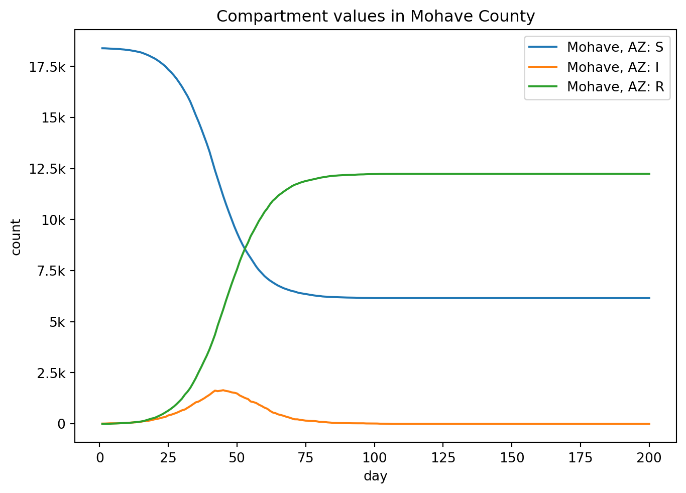
Use epymorph’s plotting features to plot the state variables (compartments) over time.
Display the transition events over time on another graph.
Solution
Much like the table methods used in Exercise 1, the output object has a plotting tool for drawing line graphs.
out.plot.line( geo=out.rume.scope.select.all(), time=out.rume.time_frame.select.all(), quantity=out.rume.ipm.select.compartments(), # select compartments title="Mohave County: state variables over time",)
Notice that the \(R \to S\) event is included in the graph, even though it’s always zero. The event is still part of the IPM structure, so it’s still shown. If we wanted to exclude it, we could have selected a subset of the events instead of all of them (which is the implied default).
Exercise 3
An important feature of all epymorph models is that they are stochastic, meaning that at each time step, a draw from a probability distribution determines which and how many transitions between IPM compartments occur. Thus, to get an accurate picture of the likely infection dynamics, we usually run the model many times (multiple “realizations”). We can plot all of these on one graph and highlight the median values to get a sense of the overall patterns.
Steps
Run 20 realizations of the simulation and store the outputs in a list.
Plot all realizations’ \(S \to I\) events on one graph: one thin line per realization.
Solution
Repeatedly running the simulation (without a fixed RNG seed) will produce a unique output each time.
# We can re-use the same BasicSimulator (and thus the same RUME)# that we created in Exercise 1.def simulate():return sim.run()realizations = [simulate() for i inrange(20)]
epymorph has a lower-level plotting method (line_plt) that enables us to customize our graphs a little more than the basic method. We have to use matplotlib to create the figure and axes, and then we use epymorph to render the line for each realization.
import matplotlib.pyplot as plt# Set up matplotlib figure and axes.fig, ax = plt.subplots()# Loop over each realization and plot the S->I events.for output in realizations: output.plot.line_plt( ax=ax, # include the matplotlib axes to draw on geo=output.rume.scope.select.all(), time=output.rume.time_frame.select.all(), quantity=output.rume.ipm.select.events("S->I"), # select just S->I# To customize the styling of the lines,# we can also pass additional keyword arguments (kwargs)1# which get passed through to the underlying matplotlib calls. line_kwargs=[{"linewidth": 0.65, # make the lines thin"color": "blue", # and the same color"alpha": 0.5, # and semi-transparent }], )# The rest of this is typical matplotlib stuff.ax.set_xlabel("day")ax.set_ylabel("New Infections")ax.set_title("Mohave County: new infections in 20 realizations")ax.grid(True)fig.tight_layout()plt.show()
1
In this case, “passed through” implies that our method, line_plt, will ultimately call another method, matplotlib.axes.Axes.plot (in addition to performing its own logic). The value that you give to us as line_kwargs, we will give to the matplotlib method as its kwargs argument. Thus anything that counts as a valid option for plot is also a valid option when calling line_plt. One slight difference, though, is that line_plt might be used to render multiple lines with one call (depending on what you’ve selected) and you might want to style each of those lines differently. So we require you to provide a list of dictionaries. If there were multiple lines drawn, we would cycle through this list for each line. In this example we’re only drawing one line at a time, so we’ve specified a list containing a single dictionary.
Exercise 4 (Advanced!)
Part of what makes epymorph so powerful is not just that we can run simple simulations, but that we can use it to explore disease dynamics in rich detail.
Part 1: Because infected individuals are immune to measles after they recover, diseases like measles exhibit “burnout”. Infections will initially increase rapidly, then reach a peak, and finally fall off towards zero. This is because there are fewer and fewer susceptible individuals available.
Part 2: The basic reproductive number of the pathogen (\(R_0\)) for our SIR model is represented mathematically as the ratio of transmission rate to recovery rate: \(\beta / \gamma\). This value has an impact on total number of individuals that ultimately become infected during an outbreak.
Steps
How does the time to burnout change as the transmission rate (beta) increases? Run multiple simulations with different beta values and plot the results to show how the dynamics of the Infectious class changes in response. (Try values between 0.35 and 0.75.)
How does \(R_0\) affect the total number of individuals that ultimately become infected during an outbreak? Run multiple simulations with different \(R_0\) values and plot the results to show how \(R_0\) is associated with the total. (Try values between 0.01 and 6.)
Solution
Part 1
Selecting a range of beta values from 0.35 to 0.75, we can run a simulation for each. We override the beta parameter for each run individually and store the outputs in a list.
def simulate(beta):return sim.run(params={"beta": beta, })# Choose beta values to test.beta_values = [0.35, 0.55, 0.75]# Simulate for each beta value.results_for_beta = [simulate(beta) for beta in beta_values]
line_plt doesn’t automatically add a legend, but we can do it ourselves.
As beta increases, the new infections curve peaks earlier and reaches a higher peak value, it burns out faster (and hotter). A lower beta takes longer to burn out and the peak is lower. In public health during a real outbreak, if you can put interventions in place which lower the effective transmission rate, you can “flatten the curve”. The graph perfectly illustrates this effect in action! Flattening the curve doesn’t necessarily reduce the total number of infections, but it does give healthcare systems more time to respond and treat patients, which can save lives.
TipDealing with randomness
Because epymorph simulations are stochastic, the computed results will vary for each run. It’s possible for outliers to obscure the pattern you’re trying to see. If we were being more rigorous, we would run a number of realizations for each beta, compute the median curve for each beta, and compare these instead. That would give us a more robust picture of the dynamics.
Part 2
To study the relationship between \(R_0\) and total infections, we will select a range of \(R_0\) values and run simulations for each. \(R_0\) is not itself a RUME parameter, so we have to reflect that value in the values we choose for beta and gamma. Just to simplify things a bit, we will use a fixed gamma and calculate the corresponding beta. But you could try varying gamma as well: you’d find that the results are similar.
import numpy as npdef simulate(r0): gamma =0.25# fix gamma beta = r0 * gamma # calculate beta out = sim.run(params={"beta": beta,"gamma": gamma, })# If we know the index of the S->I event, s_to_i = out.rume.ipm.select.events("S->I").event_index# we can compute the total from the raw output events array.# Note: we're not returning the output object this time, but a number.return out.events[:, :, s_to_i].sum()# Create an array containing a range of R_0 valuesr0_values = np.linspace(0.01, 6, 50)# Compute the total number of infections for each R0 value.total_infections = [simulate(r0) for r0 in r0_values]
Now we plot cumulative infections on the vertical axis and \(R_0\) on the horizontal axis. There isn’t a built-in epymorph plotting method for this, so we’ll just use matplotlib directly. Thankfully it is a simple graph!
Once again, being at the mercy of stochasticity here, while we should get a curve which is close to the theoretical expectation, it may not be exact. From this result we can see that as \(R_0\) increases, the total number of infections also tends to increase (nonlinearly). This makes intuitive sense. We know by definition:
\[R_0 = \frac{\beta}{\gamma}\]
\(R_0\) is proportional to \(\beta\). A higher \(\beta\) means transmission occurs more readily, generally resulting in more total infections.
And \(R_0\) is inversely proportional to \(\gamma\). A lower \(\gamma\) means recovery from infection takes longer, which gives infected individuals more time to spread the infection. Thus, we also generally get more total infections.
Additionally, notice that below a certain threshold (about \(R_0 < 1\)), the total number of infections is very low: close to zero. In this case, the disease is not able to sustain an ongoing outbreak and dies out quickly. Random chance means that sometimes you can still get a small outbreak before it dies out and other times almost no infection at all.
Ultimately the limiting factor is our total population. In this model, people are immune after recovering and so can only become infected once.